¶ Map Page Guide
¶ Overview
This guide covers everything you can do in the Map page. This includes finding nodes, node status, going to graphs from the Map page, and additional ways to set up your markers for each node.
¶ Finding the Map Page
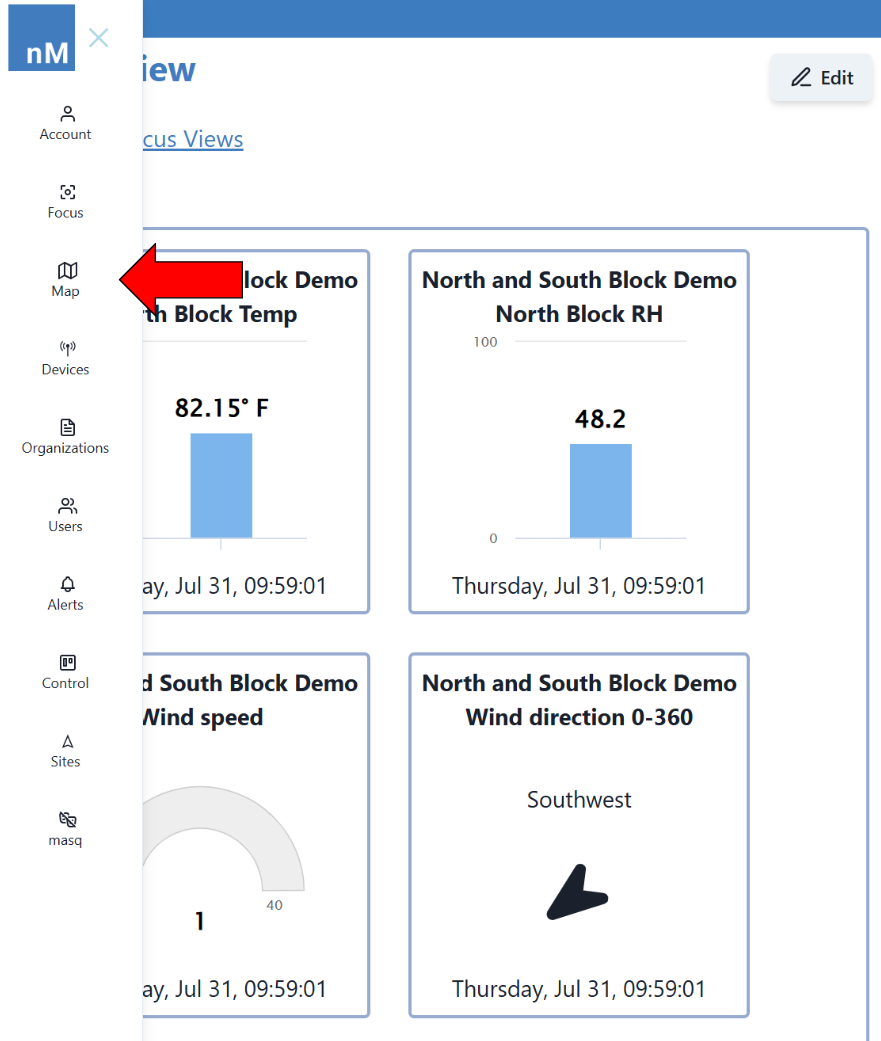
|
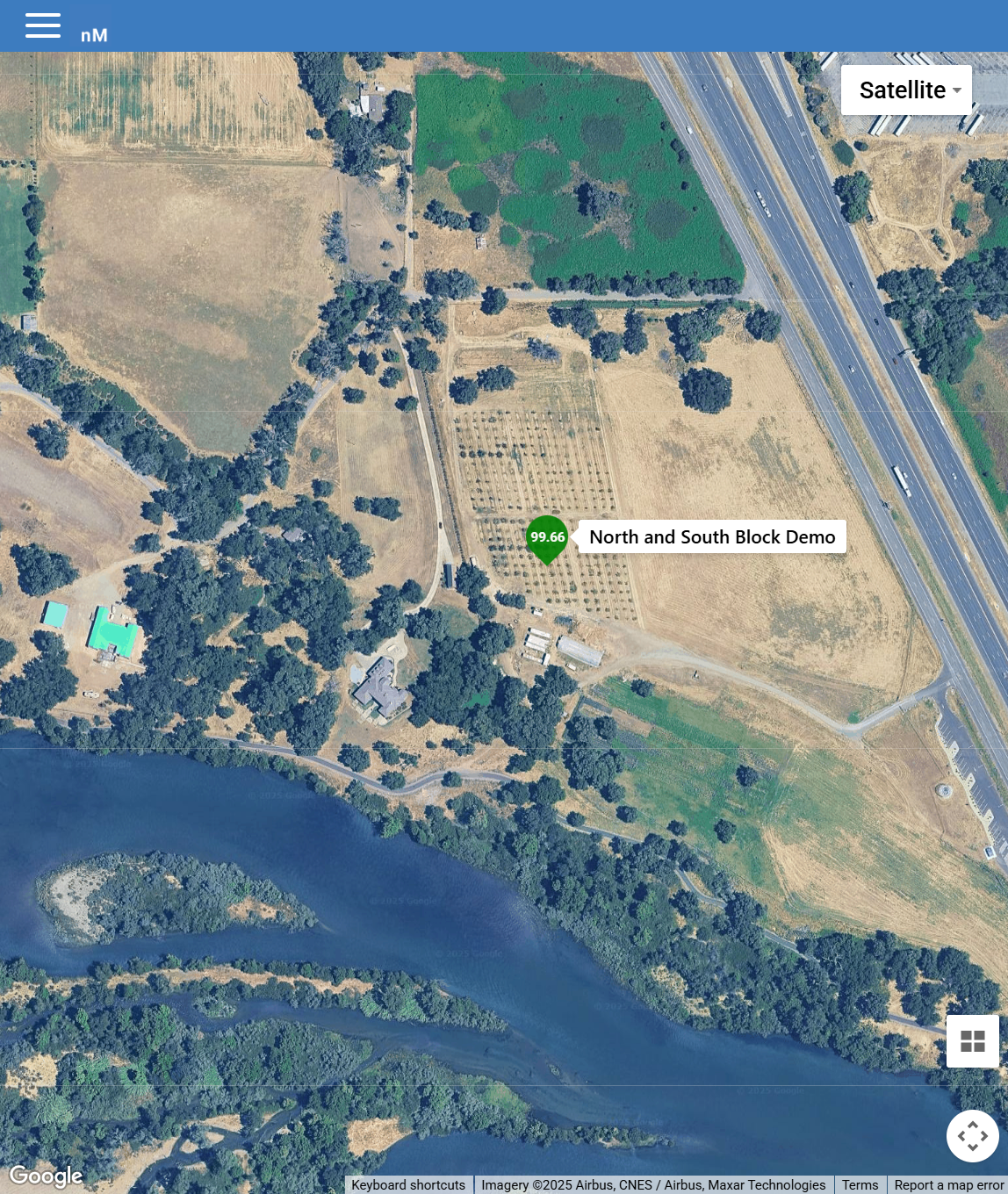
¶ Satellite vs. Map
By default the map is set to Satellite, showcasing how the area around a node looks and appears from a top-down view.
|
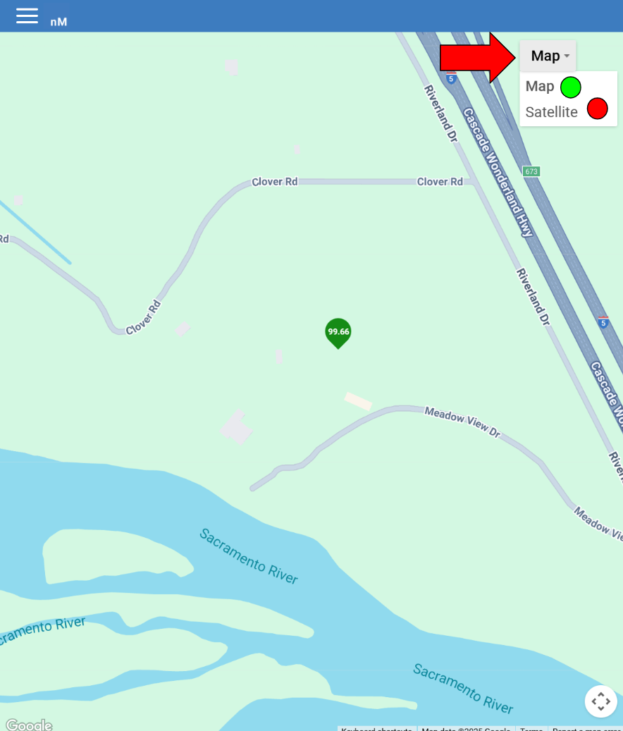
By clicking on the button in the top right corner titled “Satellite” or “Map”, you can change your map to the Map View or Satellite View. This gives you a map similar to Google Maps or Apple Maps with only roads and highways detailed.
|
¶ Using Nodes on the Map
¶ Node Marker Status
Covering your map are little markers dictating where a Node is placed. These markers will be Green, Yellow, or Red depending on the status of the node.
Green means your node has responded within the last 2 hours.
Yellow means your node has not responded for 2-4 hours.
Red means your node has not responded for more than 4 hours.
¶ Connecting a sensor to the Marker
Instead of a “Device" symbol being on your marker, you can instead have the marker track a sensor's data much like the Focus Views giving you the latest data without having to view the graphs directly.
|
|

|
Setting up markers to track sensor data is done in the Tracking Sensors Guide under Graphs.
¶ Finding the Exact Location
You can find the exact location of the node you are viewing by going into the Devices page. To find more information about how to do that exactly, go to the Devices Page Guide.
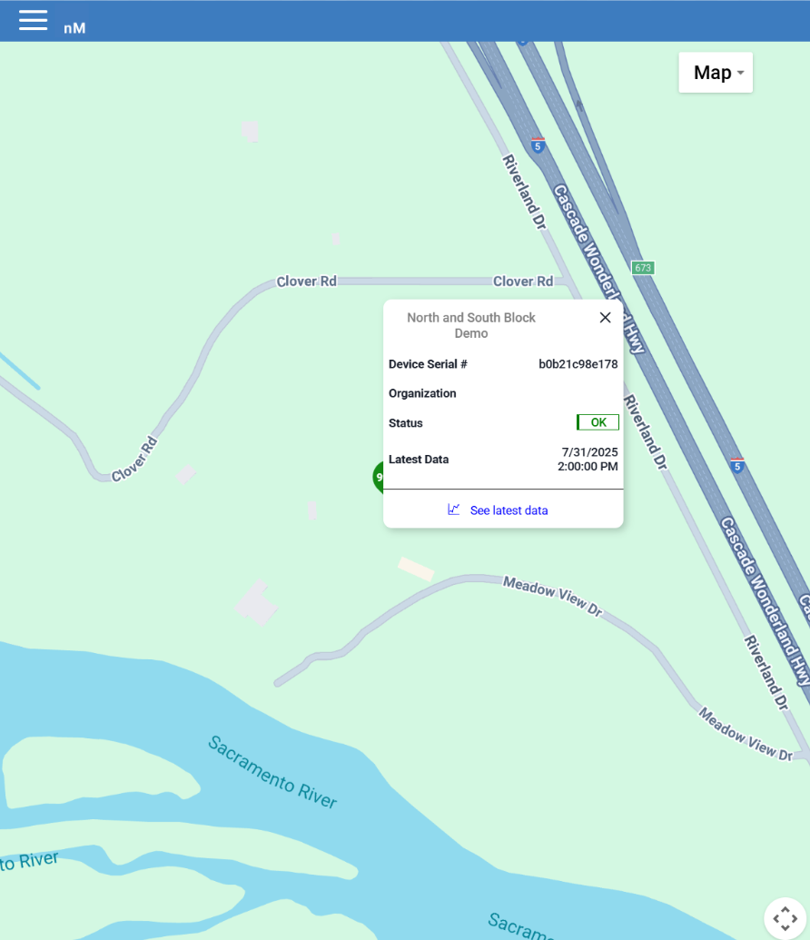
¶ What to See from the Map
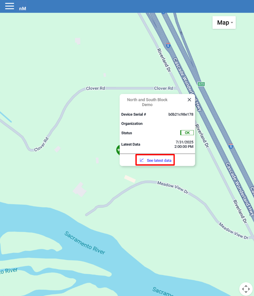
Clicking on a marker from the Map Page brings up additional data about the sensor.
|
¶ Finding Graphs from the Map
After clicking on the marker at the bottom of the popup click on the See Latest Data button. This will directly bring up the node's data in the form of a graph. To find out more about reading and understanding maps visit the Viewing Data on Graphs page.
|