¶ Graphs
This is the landing page for everything Graphs related. This includes Viewing Graphs, making Custom Views, Tracking Sensors, and much more.
¶ Overview - Graphs
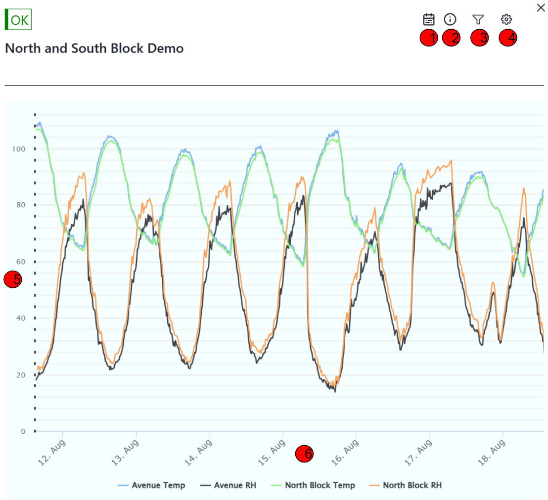 |
| 1. | Range of Time |
The calendar icon helps change the length of time the current graph is displaying. Clicking on it will give you several quick options such as Now, Last Week, Last Month, and Last Year. For a deep look, choose the Last Month option to get a good overview of how the sensors are behaving. Additionally at the top of the pop up there is a way to enter in a Custom Date Range to focus on a specific length of time you are curious about. |
| 2. | Device Information | Clicking on the exclamation mark icon brings up the Device Information. This includes the Serial Number, Organization, and the Time and Date of the Latest Data received from the Device. |
| 3. | Filter/Views |
Clicking on the Filter Icon will bring a pop up displaying the Custom Views made in the Configuration tab. This will let you switch between a specific view to focus on. Examples would be a view focused on soil moisture or water flow. At the top of the pop up is a Show All button. This will let you see every graph of data sent by the device. This includes both System Data and Sensor Data. Typically a Custom View will stick to only displaying Sensor Data. |
| 4. | Configuration | The Gear Icon will bring up a menu to configure your Custom Views as well as a place to enter in last minute calibrations that couldn't be made on the field. |
| 5. | Value | This is the value of the data at a specific height. |
| 6. | Time | This shows the date the data was collected on. Hovering over the data will additionally give the time the data was collected and the exact value. This part of the graph also shows what each color of line is tracking. In this example the blue line tracks Avenue Temperature, the black line tracks Avenue Humidity, etc etc. |
¶ Viewing Graphs
¶ 📊Viewing Graph Data
Click here for help interpreting data on graphs.
¶ 🔎Tracking Sensors
Click here for help tracking a sensor.
¶ Custom Views
Custom Views are important in organizing sensors into groups. By default you will see all data including System Data, covered in Viewing Graph Data. To set your default to only show Sensor Data, follow the Custom Views Guide.
¶ Calibration
Calibrations are ways to update a sensor's scaling without manually going to the field.
Click here for help making Calibrations.
¶ Smart Formulas
Smart Formulas are a more powerful of Calibration. Instead of just applying a scale on top of the sensor's data, smart formulas make an entirely new graph instead. Smart Formulas can also use multiple sensor's data together.
Click here for help making Smart Formulas.
¶ Edit Sensor Names
Sensor Names typically start out as 3 letter names. This is the maximum number of characters allowed on a neatMon Device, but can be changed to have more on the website.